After finishing the cover for “The Judgement of Gods and Monsters,” my second Patreon-funded short story, I got a lot of compliments on the cover, and a few people asked who had done it for me.
I’m still pretty cash poor around these parts, funneling most of my money toward getting out of debt, so I’ve been doing these on my own for some time. What I realized with that cover, and with the one I did for “The Light Brigade” is that I had leveled up enough at this skill that it was probably time to revisit what I’d put on the covers for my self-pubbed short stories and collection.
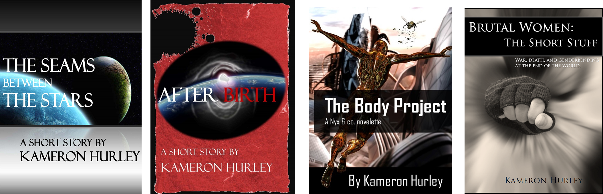
I put out most of these back in 2011 and 2012 as part of my marketing campaign for the GOD’S WAR novels.
As you can see… well, they needed some… updating:
One of the things I’ve been doing the last five years is studying covers and trying to understand what works and what doesn’t. I also study titles, but in this case I wanted to keep the titles the same just to avoid confusion, so I decided not to update those.
The break down on what I’ve figured out: covers need to clearly convey what genre you’re selling. SF needs spaceships or planets or space, generally. Fantasy does well with epic landscapes and armies and/or fighting. It’s far less important to show what happens in the book on the cover than it is to convey a feeling of the book and what it’s going to cover. You want to drive expectations: this is a story about spaceships fighting. This is a story about nobles who run with wolves. This is a story about Cthulu (tentacles. Always tentacles).
You also need to take small viewing screen into account, especially now that people aren’t just browsing on computers or laptops – but from tablets and phones. Clear, bold, uncluttered text and simple imagery will get you further than overbusy graphics. You want people to be able to easily see and understand what you’re selling.
Another thing I wanted to figure out was how to mark short stories as being part of existing worlds that I’m writing in, like Nyx’s Umayma from the God’s War universe, or the Worldbreaker series, if I ever write any in that. I came up with a lot of different text treatments, but they all seemed cluttered and difficult to understand, so I just went with a straight-up text treatment:
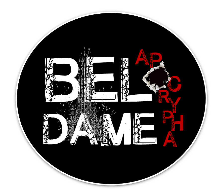
I tried this a couple of times with death heads, but bloody heads and skulls code horror, and I needed something that coded “gritty” and that was this text treatment. Yes, I considered using bugs, but every image I put together looked awful. I may go back and add a bug peeking out from the bullet hole there as an Easter egg for those who look closely, but I’m happy with how this looks on the revised covers:
————————–
Purchase
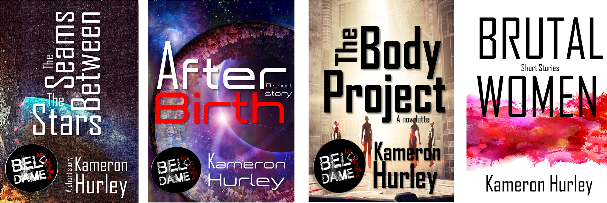
The Seams Between the Stars | After Birth | The Body Project | Brutal Women: The Short Stuff
—————–
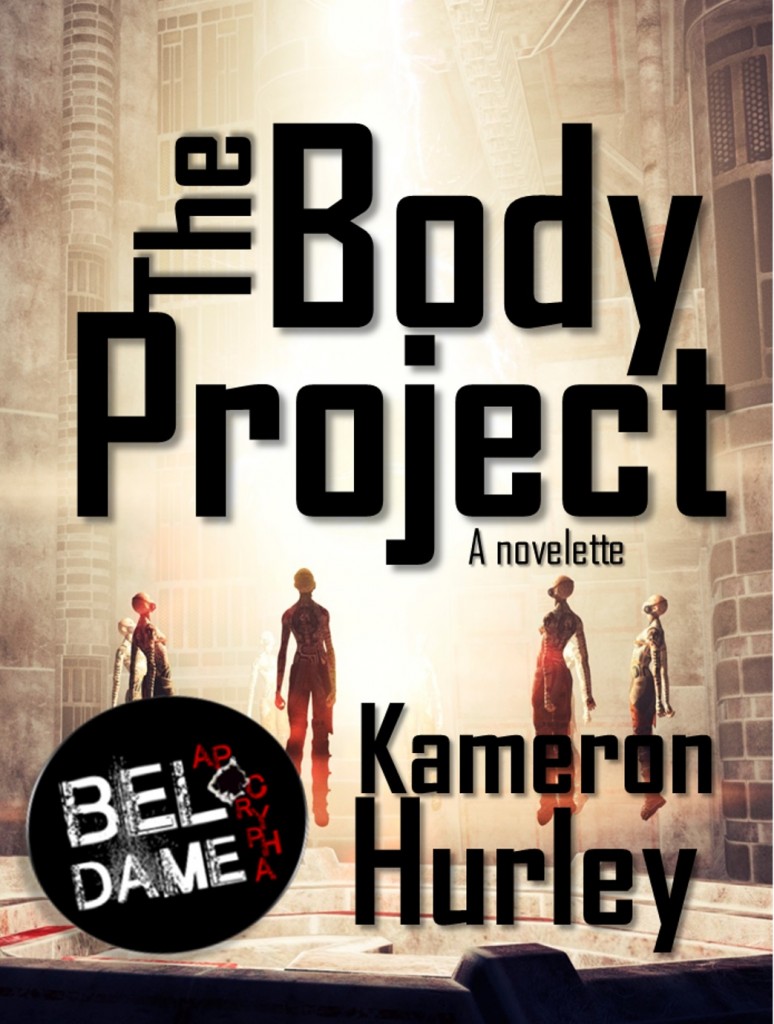
I think my most successful cover in this set is for “The Body Project.” It’s a clean design with black text on a pale background. The hovering people in the beam of light not only evoke the story, but also code SF very well without a lot of over complicated detail:
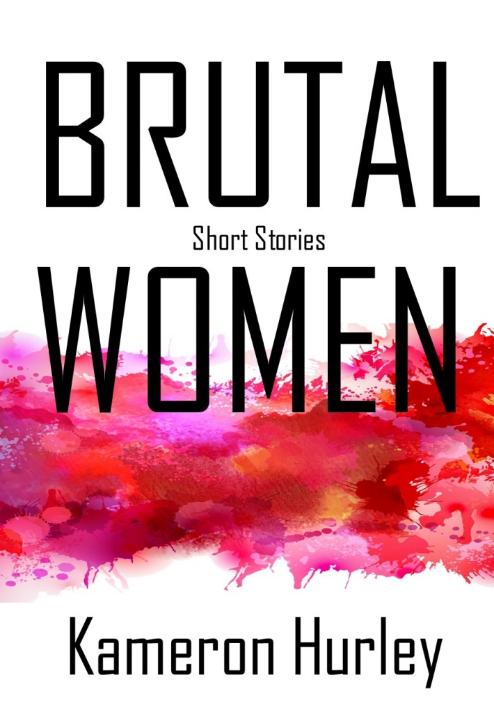
For my short story collection, I actually re-hashed a redesign I’d started for the relaunch of my old God’s War blog tour post collection, before I sold a THE GEEK FEMINIST REVOLUTION to Tor earlier this year, which contains some of those essays. It looks a little literary for what it is, but yanno, fuck it, so does Ursula K. LeGuin’s covers:
I’ll also be curious to see what affect, if any, new cover designs have on these old stories. I’ve always been keen on running cover/pricing experiments on self-pub stuff, but just never had the time. So far I can say, after a few days, that it’s absolutely no difference whatsoever.
Folks ask me, often, why I don’t go full self-pub, and the reason is that the types of books I write just aren’t suited as well for digital-only. They’re complex books low on romance and supernatural elements. They aren’t the world’s most accessible books. There’s a far greater audience for 100-level fantasy like the Dragonlance novels and The Name of the Wind than for 300-level fantasy like The Mirror Empire. That said, I’d argue the Malazan novels are far more complex than my books, and they’ve found their audience, so hope springs eternal (though the Malazan audience is not primarily digital either, I’ll note. LET US STORM THE PAPER MARKET: MY AUDIENCE POTENTIAL HAS YET TO BE REACHED).
So as much as I enjoy my little self-pub experiments, for me and my career, a hybrid approach where I’m putting up some self-pub, doing some Patreon stories, and working with three or four (or more) publishers is the right mix for now, unless somebody can give me a better deal. In an ideal world, I’d be pulling enough in traditional contracts that I could dedicate myself to one or two traditional publishers, but no one has yet made me a good enough offer to do that.
But someday soon. Sooooon.
So we carry on. We persevere, we make covers, we make deals, we keep our day jobs.
————————–
Purchase
The Seams Between the Stars | After Birth | The Body Project | Brutal Women: The Short Stuff
—————–